Guest post by Brian Jens
If you’re in the design/development world, you’re probably familiar with or heard of this scenario; a developer works with a file sent in by the designer, “something” that just can’t be coded. If you’re experienced, you hopefully won’t ever be in this situation. However, it can still happen due to lack of communication.

No one wants to be in this situation. If you’re a designer, you don’t and shouldn’t need to know the ins and outs of PHP or HTML5, but you do and should understand the technicalities of feature limitations that a coding language may or may not have and the skills of your developer to actually implement them.
On the other hand, as a developer, you should know how to explain to designers in “simple terms” why design element may not be possible. It’s not good enough to just say learn how to code, even if that may seem like the right answer.
Both sides need to work together for a common good of the client. But how do you find the golden “mean” and provide the coder with high-quality material at the same time keeping in mind limitations?
With this quick overview, this predicament can easily be avoided. Whether you’re a designer or a developer, you’ll learn to appreciate the other’s side and work together as a team.
The Most Common Problems Faced by a Coder when Working with PSD
If you are a designer and often have to “share” the design with coders, you can avoid making typical mistakes by studying the troubles they may experience.
1. Color Profile
Let’s leave out the color psychology and consider the technical part.
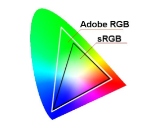
The problem with color profiles most often arises due to the lack of understanding of what is the color profile and how to select it. The most common profiles are RGB IEC61966-2.1 and Adobe RGB (1998). As for the Web, most of the designers usually use sRGB – as in Windows. The chosen profile means that we can see the image on the screen in colors defined by sRGB IEC61966-2.1 standard. The difference between Adobe RGB and sRGB is the width of a color spectrum.
But is there a problem?
Actually, there is: when creating a new project in Photoshop, designers sometimes do not specify a color profile, as a result Photoshop assigns the default value – Adobe RGB. In turn, the coder cut the received layout and at some point realizes that colors in the layout and on the page differ by a few tones.
What happened?
At the stage of storing “sliced” images, the coder uses Save for Web & Devices function, which by default converts the images to sRGB. As a result, you get colors of different shades in Photoshop and on the website. For one customer, a slight difference in the background color may not be critical while for another it may be an occasion for scandal. I know people who had to completely rework the design and the layout because of such a seemingly apparent omission as a color profile.
The solution for the problem
At the beginning of the work, please make sure to choose the correct color profile.
2. Guides
Setting guides is a seemingly simple matter. However, inattentive coder, using the guides set by the designer, cuts the image and receives the following inconsistency, “a hell for the perfectionist”:

Why does it happen?
Closer examination shows that the guides do not snap to the borders of pixels. Correspondingly, when the designer puts the guide “by the eye”, it is likely that it won’t fall evenly between pixels.
Even if the coder was attentive and noticed it, the question of where did he want to put a guide – from the left or from the right side – remains actual.
How to avoid this problem?
Please, at first, do the division, and then set the guide to the dedicated line.
3. Groups, Layers, and Masks
Remember that you should give coder the layout prepared for making-up rather than a working draft weighing around 100 MB.
But what do I mean when I say “the layout prepared for make-up?” Here are the basic features:
- Groups and layers are named: it is desirable to give names to major design elements according to their purpose and in Latin.
- If you have grouped layers, the grouping should be carried out in accordance with the logical structure of the page: the cap, content, the banner, the button, and so on. Nesting shouldn’t exceed reasonable limits; it is better to avoid the nesting of groups at all.
- Hidden layers that don’t play any role in the design have to be removed.
- Cropping photos should be carried out while maintaining the original image – it is best to do it with masks.
- Canvas size must comply with the maximum possible width and height of the design.
4. Colors

Let us return to the problems with colors. For items that are on a plan of the same color of borders/fill/font, be sure to specify the same color in the overlay settings, character properties, etc.
What nonsense – you may think – it’s clear that the color is same. But not in the case when, for example, the color of one label is different from the color of another one by only a half tone. The picky customer can easily spoil the mood of a coder if he notices the difference. As for the designer, in fact, in this case, it’s not his fault.
How to avoid this problem?
Use palettes or pre-made color sets to avoid controversy.
5. Transformations and Figures
Gone are the days when all the pictures had rounded corners. Every self-respecting web browser can round off the corners using “border-radius” CSS-property.
But sometimes there are design layouts, in which rounding is not quite round. What does it mean? At some point, the designer changed the size of the rounded rectangle with the “Transform” function, changing its proportions. As a result, the corners are not rounded but rather oval. Of course, the coder will not cut picture with a block because of it; however, it shows the designer’s slipshod approach to work.
When it comes to pixel-perfect layout, inaccuracies in the design can deliver a lot of troubles to a coder. For example, fuzzy borders make impossible to accurately determine the width of the block.
How to solve the problem?
To avoid fuzziness of boundaries, use Photoshop function “align edges.”
6. Units, Characters, and Paragraphs
Most often, you have to deal with pixels. In most cases, there is no reason to use any other units of measurement, such as points, inches, and so on. Please set pixels as a basic unit in Photoshop.
As is the case with colors, when designing text blocks, you have to stick to follow strictly fixed size values. You have to set font size and line spacing for each paragraph.
If you’ve changed the text size using the Transform, then a size or other characteristics may adopt a fractional value (eg, 14.5 px). When preparing the material to make-up, please be sure to bring all sizes to integer values. Otherwise, the coder will have a dilemma: 14 or 15 pixels?
As for the alignment, the designer should remember that browsers fully support only 3 options: left, right, and center. And it’s often very different from what we see in Photoshop.
7. Overlay Option, Layer Styles
Every designer should know about the opportunities of the modern browsers. This knowledge makes life both of the designer and the coder much easier.
Let’s see what Photoshop layer styles have a full or partial realization with the possibilities of CSS (without using pictures):
- Text-shadow.
- Box-shadow.
- Border.
- Box-shadow.
- Outline.
- Background-color.
- Background-image: background-image: linear-gradient(),background-image: radial-gradient().
- Opacity: [color:] rgba(r,g,b,a), [color:] hsla(h,s,l,a).

It is worth remembering that browsers do not support any one of the overlaying modes, such as Overlay, Screen, etc. This should be taken into consideration: you have to use normal overlay mode in combination with transparency and gradients.
I hope the given nuances of preparing PSD-layouts were essential to you, and you learned something new or, at least, found a reason to refresh these simple rules in your mind.
Knowing all about design, Brian Jens is a part of DesignContest. Apart from being a proficient designer, Brian is also a blogger and a researcher. He loves to do research related to the most controversial design topics. Therefore, do not be lazy to share the brightest ideas with Brian and get some fresh and valuable articles as the reward.