
Guest post by Emily Smith
There are a lot of websites for just one particular service, however, most of them are inaccessible and users simply refrain from using them. There could be a multitude of reasons why your site has a low conversion rate, but you should consider that it might be primarily due to poor User Interface (UI) or User Experience (UX).
Clear, right?
Not really. Even though you may know where you lack, you may still be confused as to what UI/UX are and how they affect your conversion rate. Both of these elements are crucial to a product and define the process, together enhancing the design of the website. Though they are used interchangeably or are often misused terms, there’s a major difference between the two terminologies: User Interface Design refers to graphic design and User Experience is related to the technical and analytic field.
Both of these techniques are involved in interface design and are used in crafting beautiful and functional websites.
Through this article, we’ll be exploring how to create front-end design patterns and interfaces and will create a roadmap for a easily-accessible site. So, without further ado, let’s get it started!
Typeset Buttons
Your site contains buttons and tabs that are utilized multiple times a day by users, therefore, you need to typeset them properly. Positioning the label back to its initial place so that users can easily click on it is key. Though this may seem insignificant, it’s all in the details.
You should maintain consistency throughout the site and align fonts in a specific manner. Placement is everything.

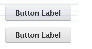 You can see the difference between these two images. In the first image, the text is exceeding the margin, making it look odd. In the second image, the text is well within the defined margin. This gives your site a complete and balanced look making the interface more optimized.
User Testing with Prototyping Tools
 User testing is an essential element of enhancing UI/UX design and site interface, making testing ideas and workflows super simple. These prototypes can be shared with users to test your interface, expand your understanding of directed flows, and learn more about what does and does not work on your site.
Padded Block Links
Links are inline elements by default, meaning that the clickable area spans only the height and width of the text. This clickable area redirects you to the link destination, increasing visibility of your site. You can do this by adding padding or even convert the link into a block element.
Here’s an example of inline and padded links, with the clickable areas highlighted to show the difference:
The larger the clickable area is, the more accessible the link. Converting links into block elements increases the width of the text area (unless otherwise specified).
Optimize UI/UX for Mobile Devices
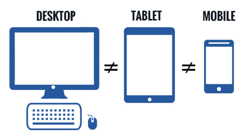 One common mistake that designers make is focusing only on one framework. However, designing for only desktop or only mobile frameworks is not a feasible option. Focus on separate versions for optimal experience. Create a separate, mobile-optimized design module to make mobile access easier. The UX design utilized for one platform may be applicable to another platform, however, the functionality may not translate. What is easily accessible and easily viewed on desktop may not be on mobile devices.
Use Contrast and Color to Manage Focus
 Your site should be capable of retaining users. For that, you need to focus on the site’s performance and outlook. Similarly, you can grab user’s attention by managing contrast between elements. You need to use the right set of colors effectively when designing the site. You can coalesce color with right contrast so that it enhances the visual experience of your site, making users shift their focus to your site the moment they come across it. This technique comes handy for displaying dates and information on forums and blogs so that they easily catch user’s attention.
Use Design Elements Like Lines, Animation, & White Space
Leaving white space eases the navigability of your site and keeps ambiguity at a distance. Similarly, you can use animations and lines in your site together with white space to enhance visual experience and design. Space between elements such as navigation bars, buttons, headlines, etc., enhances the interface element and indicates relationships between elements or groups of elements.
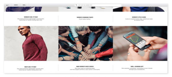 As seen in the image to the right, all the headlines are indicated above their respective article. All text is well-placed, well-spaced, and well-defined, making it more readable.
These techniques will enhance your site’s UI/UX. Using these steps effectively requires a certain amount of restraint and thoughtful implementation. By placing all the elements correctly, you’ll retain more users. Accessible sites give users a reason to visit your site again!
Emily Smith is an ed-tech enthusiast and has been associated with CWS Technology as a writer for more than 7 Years. CWS is the leading web development company offering its expertise in HTML to WordPress service, PSD to WordPress, custom android app development and much more. Emily has a passion for writing on emerging technologies like application management outsourcing, consulting, system integration etc.