A guest post from Sawaram Suthar.
Everyone has a business card right? So how can we make yours better than the rest?
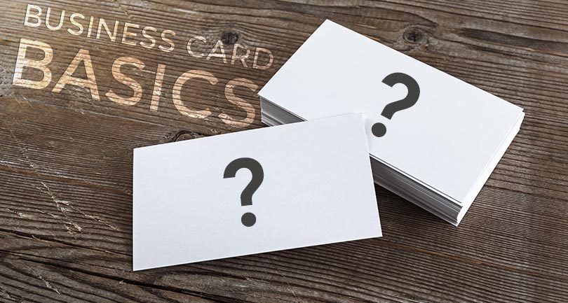
The primary focus of a business card is simple; to create an impression on target audience. It is a cost efficient, unique and proven way to improve brand publicity, business development, and networking. If you’re going to stand out, you need think creatively. The days of white cardstock with your name and phone number are gone. If you’re going to be recognized, you need to be smart about it.
A business card is so often the first impression a business can give to a potential customer, and the card’s design needs to reflect the importance of this critical first step. One way to get someone’s attention right away is to create an innovative layout that reflects the business’s brand. Take a look at some fun and innovative card design ideas here.
Cardstock Quality
I can’t tell you how many times I’ve handed someone my card, they’ve looked and it, and said “Wow, nice card.” On the flip side, I’ve been handed a lot of made-at-home cards over the years. Cards like this that are printed on normal printer paper and are at best flimsy just scream “I’m an amature” or “I’ve never been in business before.”
Your cardstock can often be a paper presentation of related business knowledge, acumen, and experience. You can see how this is a direct reflection to product or quality of service. Amit Dhumgal from The Business printers says, “quality is our top priority for any kind of printing, whether it business cards, poster or roller banner.”
Card Aesthetics
When you’re thinking about the design of your card, here are some of my top tips and tricks:
- Use a font that is easy to read and grooves with your logo. Sometimes, this can be the same font as the logo font if you’re using one. There isn’t any standard of note, but you can check some ideas here.
- Mixing two similar fonts like Tahoma and Verdana may produce a messy impact creating a typical visual discomfort. They’re just too close in style and the user will feel like they should be the same, but they’re just not. It may be akin to the ‘Uncanny Vally’ hypothesis.
- Most cards need to have plenty of white space. Remember, someone has to read this thing quickly and easily, and you want your contact information to be found right away.
- Additionally, plenty of white space easily highlights the logo and it is a simple but effective way to keep your brand clean.
Use of color
I highly recommend any designer to at least read up on Color Theory and have a basic understanding of the impact of colors on decision making. Don’t forget that even though the use of color in a business card is a preferential subject, color conventions matter for making a business card attractive and appealing.
Size Matters
A card that gets easily fitted in a wallet of standard card holder often loses its existence in the crowd of other cards. But business cards that are just a little off sized, hardly get lost in a standard card holder. Just be very careful not to go too far on this. So often cards that don’t fit on my card holder go into my pocket, then into the trash. Take a look at some of standard size of business cards here.
Life Is Like a Box of… Cards
Just like life, there are no hard and fast rules for creating business cards, but by using these tips and tricks, you can keep your cards consistent, clear, and in front of your potential customers. Best of luck on your card building adventures!
Author Bio
 Sawaram Suthar is a self-motivated Digital Marketing Consultant at LMS. He contributes new ideas, tips on digital marketing, web design and reputation management on his blog thenextscoop.com. Anyone can find him on Twitter.